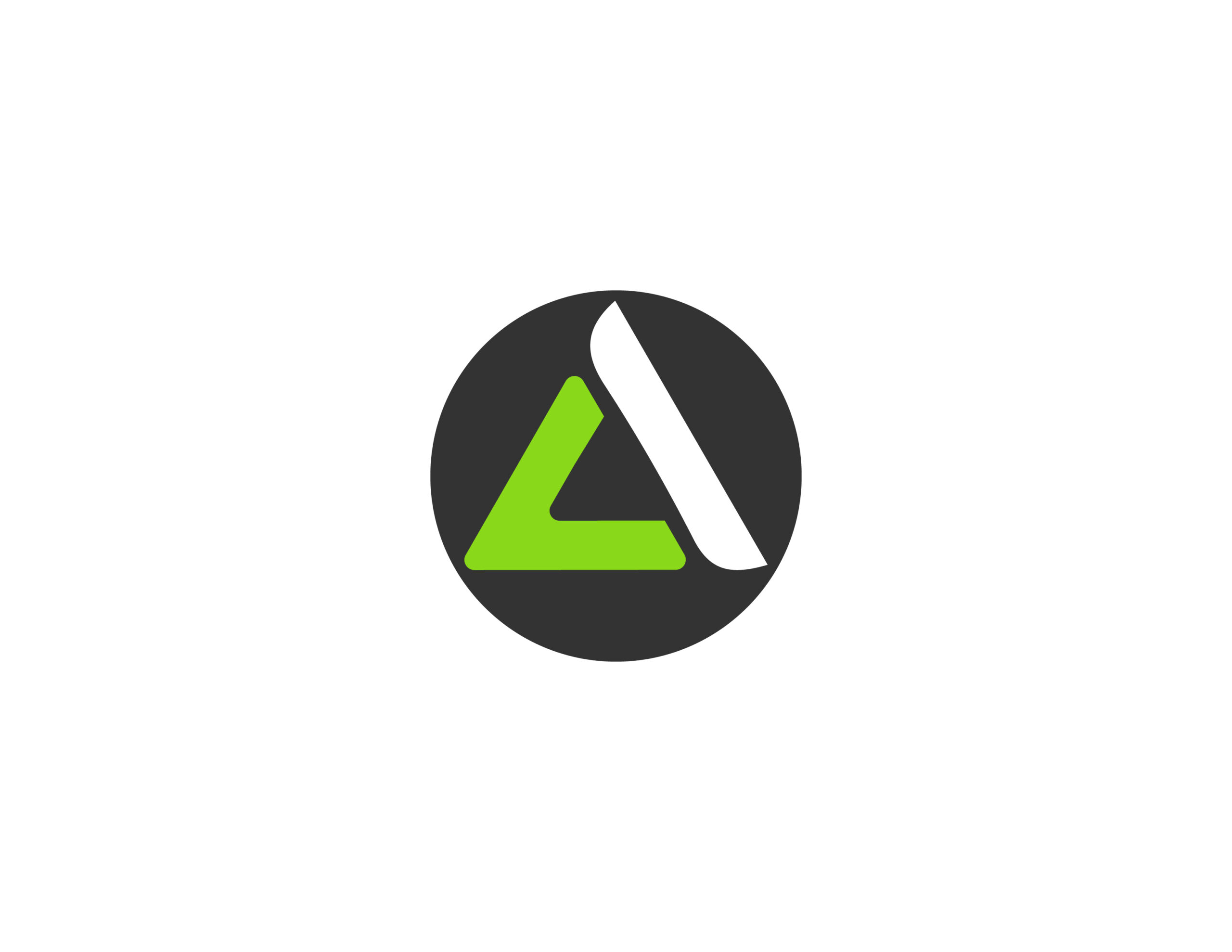
"Our team designed the AC Fitness logo with a focus on modernism and minimalism to align with the preferences of Adrián and Claudia.
The logo we crafted embodies the brand's identity by accentuating the 'A' and 'C,' which represent the initials of their names. We aimed to convey that when these letters come together, they form a pyramid, symbolizing that strength lies in unity. This translates to the idea that nutrition and training improve and create healthy lifestyles."